Cards and Tiles
Cards
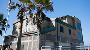
Cards are a collection of links that contain at least an image and a headline. They can be used universally throughout the site for multiple content purposes.
Cards can be converted to a slider in mobile view by adding class flexslider--mobile. By default, there are 3 cards per row on desktop view and 1 card per row on mobile view. This can be changed by adding a width class (see Helpers) alongside the card__wrap class.
Titles on headline-only cards can be centered. Otherwise, card titles must be left-aligned.
Standard dimensions for card images: 500 x 238.
Icon Cards
Icon cards use a simple grid layout along with class card-icons.
Icon images must have square dimensions (minimum 300 x 300). Apply class img-circle to <img> for circle shape. If the custom icons have a transparent background, you can change the background color using class [color name]-bg.
The label link is a <p> with class h5.
Tiles
Tiles are cards without images.
Headline Only
For tiles that only consist of a headline, add class l-flex-center alongside class card to center the headline vertically and horizontally.
Alternate Style
Headline with Description
Tiles can include a description below the headline.
-
Headline
Lorem ipsum dolor sit amet, consectetur adipiscing elit, sed do eiusmod tempor.
-
Headline
Lorem ipsum dolor sit amet, consectetur adipiscing elit, sed do eiusmod tempor incididunt ut labore et dolore magna aliqua.
-
Headline
Lorem ipsum dolor sit amet, consectetur adipiscing elit.


